
Mobile vs. desktop e-commerce traffic: How to improve conversion rates?
How consumers shop for products and services online is changing as technology evolves.
People’s choice to shop using either their phone or computer really affects how likely they are to buy something. It also affects how happy they are with their purchase.
Stores need to understand why people choose different devices for online shopping. By understanding it, businesses can make the shopping experience better for their customers.
Before we start, here’s a quick question for you guys.
When you shop for something online, are your purchases made through mobile phones or a laptop/desktop/tablet?
Note it down next time if you can’t recall it right now. If you’re a marketer or an aspiring entrepreneur, you need to understand some of these consumer trends.
Understanding your mobile vs. desktop split
Users commonly switch devices throughout the day. From shopping, browsing social media, and catching up with friends, to reading the news. This makes optimizing your digital experience a more nuanced process than we might like.
A funny thing about consumer behavior is that we ourselves are consumers. Every theory and statistic pertaining to a consumer’s behavior also applies to us.
Obviously, no two people behave in the same way, and therefore their shopping habits might differ from each other. Still, most consumer behavior theories come true on a more generalized scale and with a bigger sample size.
It’s absolutely essential that you understand your mobile vs. desktop split. Based on that, prioritize your digital strategy.
If most of your traffic is via desktop, yet conversion rates are noticeably higher on mobile—or vice versa—it’s time to reconsider where you invest your time and resources for the biggest returns. How can you better incentivize your mobile customers to get more shoppers browsing via mobile?
Or, if the desktop generates a much higher average order value, how can you better streamline your mobile-to-the-desktop experience, such as allowing users to save items on mobile to finish the conversion on the desktop then?
We can see from the share of traffic by device and industry charts that mobile has gained more market share in all sectors. The biggest swing has been in retail, with mobile traffic growing by almost 8% over three years.
Mobile vs. desktop conversion rates have slightly improved, which makes sense, given the mobile traffic growth. However, there’s still growth to be had in all sectors for mobile sales, specifically in Travel and Retail.
Today’s consumer is happy to shop on both desktop and mobile, and we expect seamless experiences on both—so your strategy should reflect that.
So although mobile was the device of choice for many of us, desktop still accounts for 39% of all online traffic. This slim margin indicates desktop sessions are still critically important to optimize!
Moreover, the device you prioritize will also depend on your industry. Here’s an example. We noticed that luxury, cosmetics, and pharmaceuticals have a significant majority of traffic on mobile (between 73% and 76%). Something to think about!
Barriers to Conversion
Although e-commerce businesses are making considerable headway in optimizing their sites for mobile users, omnichannel consistency is still an issue for consumers.
90% of US internet users move between devices to complete a goal. Yet, there is still the inability of retailers to carry user information from one device to another. That is one of the most disappointing e-commerce shopping experiences customers still face.
Optimizing omnichannel consistency using behavioral data is an effective way retailers can re-engage with their e-commerce customers. For example, if a customer has been browsing jackets on a mobile device, they can first be shown relevant homepage category banners when they re-enter the site on a desktop.
Screen size is also a considerable barrier, especially regarding high-value products. Customers are more comfortable making final purchase decisions on expensive items on desktop screens as site navigation is less cumbersome.
Optimizing the checkout process using notifications can help to ease the burden of security concerns. For example, if someone takes too long to check out, they can offer help from a customer service representative.
Bridging the gap between mobile and desktop
No one can predict when mobile shopping will be as popular as shopping on a computer, even if you make your website good for mobile users. But we know that customers favor omnichannel experiences when engaging with online shops. In fact, there are still opportunities retailers can take to bridge the gap between the mobile and desktop shopping experience to move leads through the sales funnel more effectively.
Even though fewer people buy things on their phones, they still use their phones to look at products and think about buying them. So, mobile user experiences shouldn’t be neglected.
The report by Wolfgang Digital found a strong correlation between high percentages of mobile traffic and high overall website conversion rates. This might seem strange, but it shows that people use their phones to decide what to buy and then use their computers to make the purchase.
The average US household has 7 active connected devices in use each day. In the UK, the number rises to 8.3 connected devices – marketers can no longer assume that mobile users and desktop users are different people.
More people might buy things on their phones by making mobile shopping really good and offering great customer service. For expensive things, people usually look at them on their phones and then buy them on their computers. So, giving customers a good experience on both devices is important. Using desktop, mobile, and offline as isolated channels could harm your overall business strategy.
Progressive Web Apps (PWAs) are a new standard for online stores to make their websites work well on phones. PWAs offer a seamless app-like experience in the user’s mobile browsers, loading faster than regular apps and using less data.
Stores in the beauty and travel industries have had success using PWAs. For example, the beauty brand Lancôme saw more people staying on their site and fewer people leaving it. Also, more people made purchases.
As more stores go digital, it’s important to have an omnichannel strategy that works and puts customers first. This will help stores make more money online and get more people to buy things from them instead of other stores.
Improve mobile conversion rates
What can websites do to resolve this issue if lower mobile conversion rates result from checkout? In other words, it involves ensuring that the procedure is as user-friendly as feasible on mobile and that filling out forms requires the least effort.
Updating Mobile Forms
A well-designed mobile form may significantly increase conversion. They lessen friction, inform consumers of the requirements, and prevent basket abandonment.
Mobile-friendly forms must be simple to fill out, have a clear visual layout, useful error messages, and be as brief as possible to minimize user effort.
Add shortcuts for users on mobile
Any feature that reduces work is beneficial; here, shops may benefit from some smartphone functions.
For instance, credit card or passport scanning options can spare consumers the trouble of inputting data and ease the burden of checkout.
Little things like auto-filling form fields or utilizing the most appropriate touchscreen keyboard by default all contribute to time savings by simplifying the data entry process.
Make the booking process easier
As it’s typically more difficult to arrange travel than many retail transactions, travel presents the largest problem on mobile.
For example, choosing hotels and flights during a vacation may require customers to submit additional information beyond their typical address and payment information, such as passport numbers, traveler information, and in-flight options.
Making the online booking process for travel as mobile-friendly as feasible using forms made for mobile is crucial. For instance, a single-column layout and bigger form fields, such as this Best Western checkout form, make it easier for consumers to submit information and reduce user error.
Messaging conversion for mobile
Conversion rate optimization techniques like the usage of urgency can still assist in boosting sales whether visitors are using mobile or desktop.
Saving information is crucial, particularly in the travel industry, because individuals frequently visit and cancel reservations before a final choice.
Mobile emails may also employ urgency marketing techniques like countdown timers to the closing of a sale period. Also, push notifications have significantly impacted sales conversion through mobile apps.
Offer a range of payment options
Entering payment information is a crucial component of mobile checkout. Any shortcuts are helpful because doing this on a smaller screen might take longer and be more annoying.
One choice is to preserve client payment information wherever it is practical. Therefore, they may log in and checkout without inputting their address and credit card information. Offering a variety of payment choices that give practical shortcuts is another possibility.
Checkout may now be completed with just an email address and password thanks to widely used digital wallet services like PayPal and Amazon Pay and more recent choices from Visa and Mastercard.
Improving desktop conversion rate
There are a variety of techniques to boost desktop conversions, such as optimizing page loading speed, utilizing interactive elements on your pages, providing viable content offers, creating a seamless checkout process, and leveraging trustworthy customer reviews.
While there are many tactics to improve desktop conversion rates, one of the most effective methods is optimizing your website content and design. Simple tweaks to web page layout, such as featuring important call-to-actions prominently, breaking text into short sections, and organizing information in a logical manner, can make all the difference when it comes to encouraging visitors to stay on your website and take action.
Additionally, using tools like A/B testing and analytics provide valuable insights into user behavior that can help further refine and optimize your site content and structure for higher conversions.
It’s important to consider how users access your e-commerce site and ensure the experience is optimized for mobile vs. desktop e-commerce solutions. By following the tips we’ve outlined in this blog post, you can improve your conversion rates no matter what device your customers are using.
Why desktop is still important for e-commerce
Although tablets and smartphones are becoming more popular, desktop computers still have a few benefits over their mobile counterparts. The relative comfort of conducting research with a full keyboard and a large screen is undoubtedly the most significant.
You want to have all your research resources on hand when you’re getting ready to make a major purchase, such as a new smartphone, piece of furniture, or appliance. Though mobile screens are becoming larger, you’ll discover that most individuals prefer to conduct research on a PC. It is due to its simplicity and the mental space it provides instead of multitasking when on the go.
However, as anyone will tell you, the fact that larger sales often take place on the desktop is in no way an excuse to give mobile less attention. One reason is that making frequent smaller purchases may result in significantly greater profit; also, merchants can boost their income by improving their omnichannel experiences.
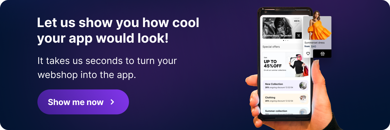
Benefits of mobile apps for your online store
Although you can always optimize your website for mobile phones, a better option for your e-commerce business is to turn your online store into a mobile app. Let us show you why.
Increased customer satisfaction
Mobile applications have improved the buyer’s user experience journey much as e-commerce has made buying simpler for consumers by giving them the freedom to purchase whenever and wherever they choose.
Simple Access
A mobile app allows anybody with a smartphone to shop. Besides, people can use WiFi or their cell data pretty much anyplace. Additionally, it’s where your clients spend their time. The advantages are clear since most individuals always have their phones with them. We know that we must reach the audience where they are currently spending time.
Mobile apps operate more quickly and smoothly
Apps function one and a half times quicker than mobile websites on average. Because apps keep their data locally on the user’s device, it is virtually immediately accessed when the user requests data.
Another reason mobile applications are quicker is that they are built on frameworks rather than JavaScript, which is what the mobile web is built on. All of this adds up to a significantly smoother and quicker experience for your user.
Mobile apps provide personalized content to your users
Users appreciate customized content. You may provide customers with just that, thanks to your mobile app. Depending on their interests, actions, location, and preferences, your clients’ experiences may be personalized. They can define their own experiences, or you can use deep learning strategies ahead of time for them.
Therefore, your consumers may access the content they want to view whenever they want to, using a mobile app. It is installed on their phone and has the ability to deliver push reminders.
Mobile apps provide access even if the user is not online
While consumers cannot complete a sale offline, they can add the offerings to their cart. This will be saved and ready for completion whenever the app, your website, and the cart can connect.
Mobile apps make use of the built-in capabilities of your phone
Compared to mobile vs. desktop e-commerce, several important built-in functions on mobile phones may be exploited to your benefit. Consider what would happen for your customers if your store’s app could provide them with a personalized experience depending on their GPS location. Or users may use their camera or PDF to upload a bar code. Or even fingerprint verification to authenticate transactions, to search for what they want.
E-commerce will be M-commerce!
Here’s the deal. If your products/services cost below the $100 mark, you can’t ignore mobile devices as a part of your marketing plan.
If this is your case, mobile devices should be your primary devices to target in all your digital campaigns. Make sure your website is mobile-optimized, and if you have a big enough product catalog, think about building a mobile application for your services.
90% of the time people spend on mobile is spent using apps.
If your marketing is omnichannel, it is extremely likely that you’re trying to engage with prospects on social media. Social media can be a powerful tool but also form a big part of the “marketing black hole.” Traffic from the “marketing black hole” cannot be attributed and tracked back to the original source. People might have seen your ad on Instagram or YouTube, searched for your brand name organically on a desktop, and bought your product/service. In a scenario like this, the conversion is attributed to the desktop, even though the major driver of the purchase was a mobile device. Sometimes, stats do lie.
In September 2020, Google introduced mobile-first indexing for the whole web. Here’s what Google had to say in their official announcement:
“Mobile-first indexing has come a long way. It’s great to see how the web has evolved from desktop to mobile and how webmasters have helped to allow crawling & indexing to match how users interact with the web!”
Mobile-first indexing basically implies that Google primarily uses the mobile version of the webpage for ranking and indexing purposes. This further highlights the change in our browsing behavior. In the coming years, mobile will solidify its position in terms of overall contribution to traffic.
As more and more retailers shift their focus from desktop optimized to mobile-optimized landing pages, transactions conducted on mobile phones can only go up. The future of retail is mobile. E-commerce will soon just be M-commerce.
Okay, so what should I do now with all this information?
If you work (or run) for a company that sells products or services directly to consumers on your website (thanks to disintermediation), and if your offering costs more than 100 bucks, it is highly likely that the majority of your sales are coming from the desktop. This doesn’t mean that you should disregard the mobile platform; it just means that you can make your marketing more efficient by leveraging how consumers behave.
After all, understanding the customer journey to improve marketing efforts is the ultimate essence of all consumer behavior studies.
Look at the cross-device report inside of Google Analytics, and you’ll see some eye-opening details. Mobile devices are powerful tools when it comes to the customer journey ending at the point of purchase. Most of the final transactions might not occur on a mobile device, but still, this is usually where people see your ads.
This is where customers spend most of their time. People research products on their phones. They watch review videos on their phones. Phones are the reason why social media is so popular. It’s the reason why Facebook, Snapchat, and TikTok’s ad platforms work.
Conclusion
People are using mobile devices more than ever for online shopping, and this has changed how we buy things online. Stores need to adjust their strategies to match what customers like and how they shop. Both mobile and desktop are important for making sales, so stores should make sure their websites work well on both. Privacy and security concerns can make it harder to buy things on mobile, so stores should make sure customers feel safe and supported. Stores should also make it easy to check out on mobile by using simple forms and different payment options. Overall, stores need to think about all devices and make shopping easy and enjoyable for everyone.


